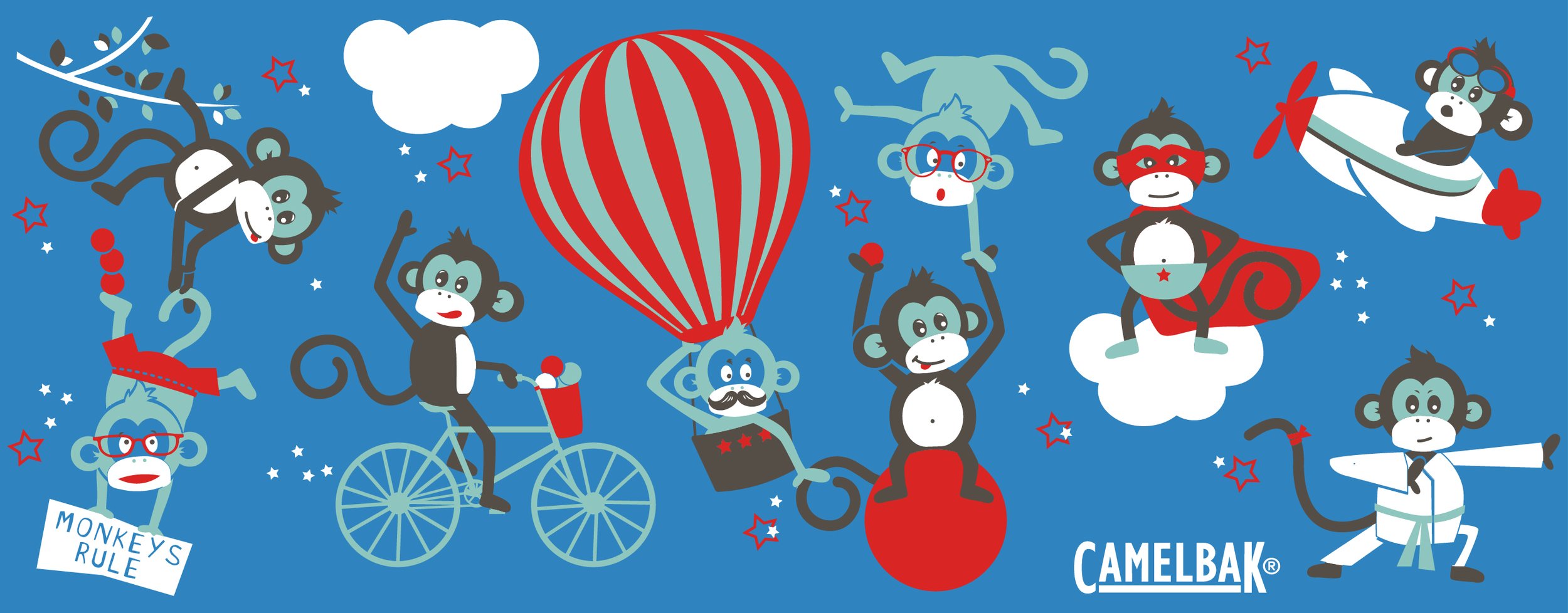
Designing with CamelBak is one of those yes, please—more of these kinds of projects. I was handed a thoughtful brief and the freedom to play. From there, I explored a range of themes that blended bold visuals with functional design, all tailored to the CamelBak brand.
-
Worked from a design brief and reviewed CamelBak’s brand guidelines to align with their voice and audience.
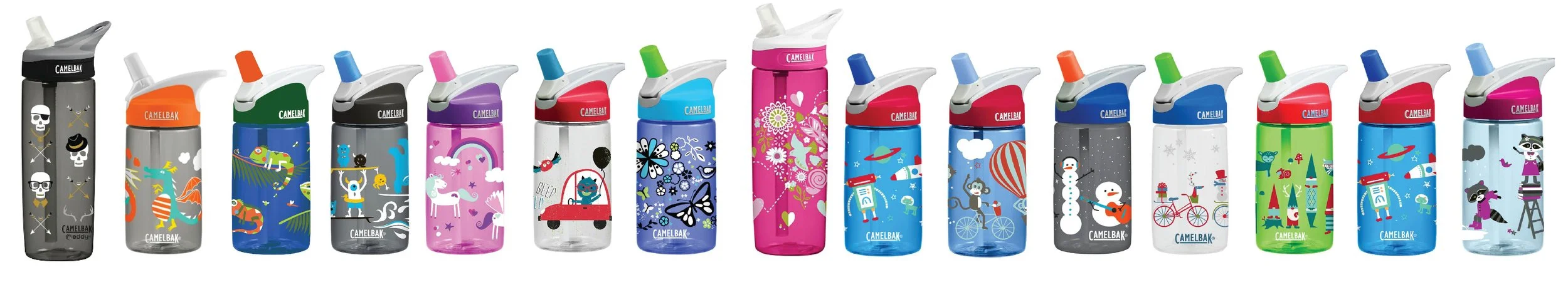
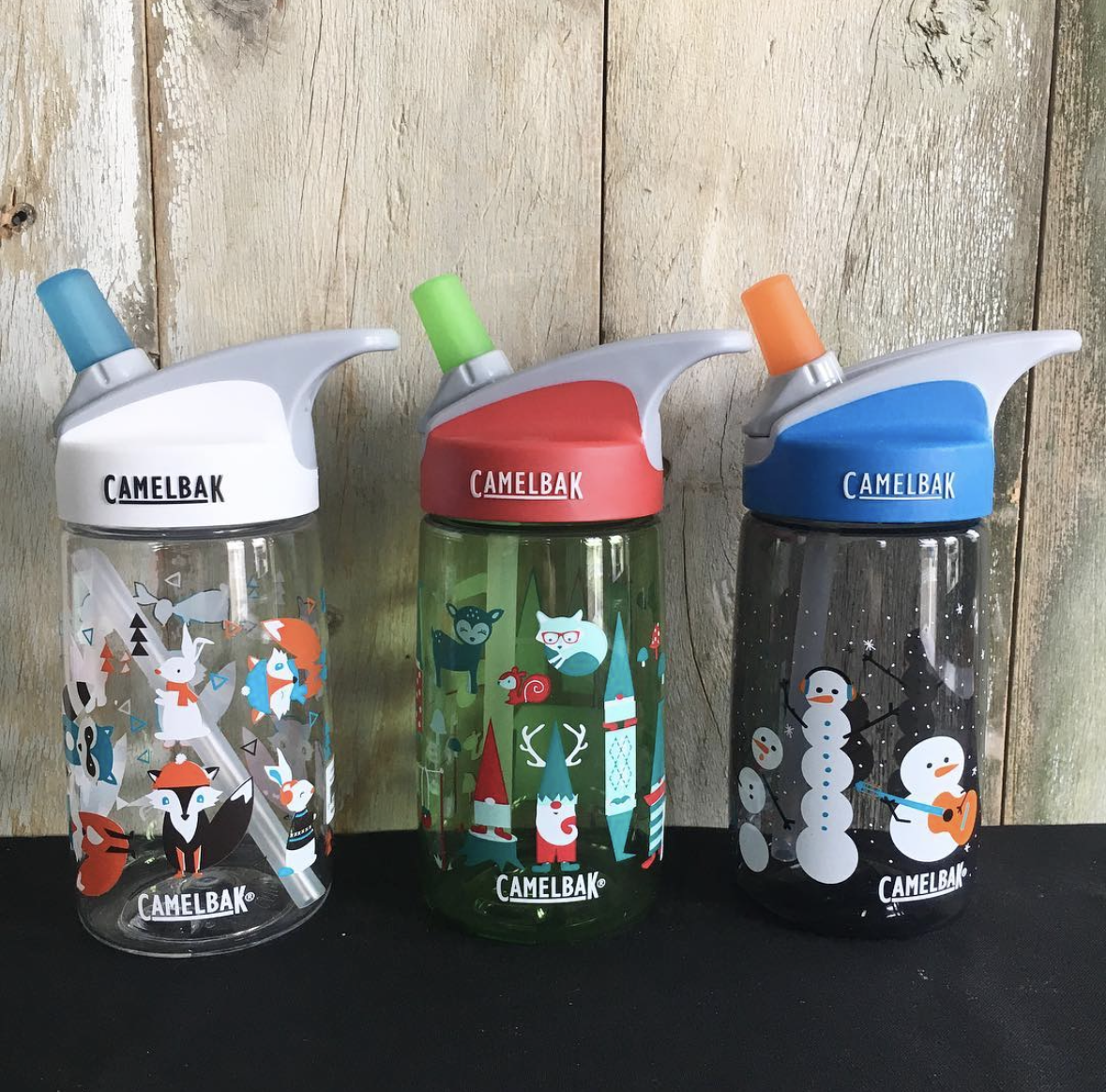
Developed multiple themed collections, each created within a tight, purpose-driven color palette to meet manufacturer requirements.
Adapted designs to work with CamelBak’s unique print processes, including color separation for screen printing and layout formatting specific to their bottle production specs.
Balanced brand consistency with fresh, trend-aware graphics—blending playful energy with outdoor utility.
Delivered final production-ready files, reviewed for accuracy and technical fit, with an eye toward shelf presence and retail appeal.
-
Designs launched in Target, REI, Harmons, and other major retailers—bringing CamelBak’s brand to life through approachable, high-impact graphics. The collaboration was a creative dream: clear goals, creative freedom, and a product that looks just as good on the shelf as it does out on the trail.